Sep 28, 2012

Worlds Population by Latitude and Longitude


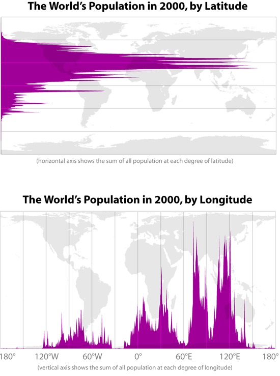
Never saw this before: The Worlds Population by Latitude and Longitude.

And another interesting fact about world Population (and well worth an infographic): 44 % of the world's population (more people than inhabited the entire globe in 1950) live within 150 kilometers of the coast. In 2001 over half the world's population lived within 200km of a coastline. The rate of population growth in coastal areas is accelerating and increasing tourism adds to pressure on the environment.

Information is Beautiful Award

Seriously?
This is the winner from the Information is Beautiful Award in the Category Infographic / Information Design:


Gold: Cover Mania by Michele Mauri. This infographic, which appeared in the Italian newspaper Corriere della Serra and can be seen in its entirety here, shows how The Beatles became the 'most covered' band ever.

Sep 27, 2012

João Luís Carrilho da Graça: Pedestrian Bridge Over The Carpinteira

João Luís Carrilho da Graça: Pedestrian Bridge Over The Carpinteira


 The sinuous and segmented design of the bridge winds above the valley, along a distance of about 220m. The central takes a path perpendicular to the line of the valley. The other two sections are inflected and oriented towards their anchoring points. The connection between the two points is no longer the shortest distance between them. The tense geometry of its layout interferes with visual orientation and with the perception of dominating heights of “serra da estrela”, on one side, and with the vastness of “cova da beira” on the other.

This way the Portuguese architect João Luís Carrilho da Graça describes the Pedestrian Bridge Over The Carpinteira.

More images after the Jump.


Francis Bacons screaming pope comes to auction


Screaming pope was bought for £71,500 40 years ago Its now expected to reach £15 million

Datavisualization and optical Illusions

Opticalillusion1


The chart would be much improved if a longer time series is included giving us values for each year. It's pretty clear that this data is subject to sudden jumps (e.g. Armstrong's death) and so picking arbitrary years will likely cause is to miss important events.

Read more after the jump.


Sep 26, 2012

An impressing Chrome Experiment

The WebGL Globe is an open platform for geographic data visualization created by the Google Data Arts Team.

The Globe can be moved around as expected.

Global Populatiom
More Information and how to make your own after the jump.

Sep 24, 2012

Stephen Few vs. David McCandless, again


I recently spent a day with the bright and thoughtful folks at SAS who developed the visual exploratory data analysis tool named SAS Visual Analytics, and for the life of me I couldn’t fathom why they would undermine their product with flashy nonsense that threatens the integrity and reputation that SAS has worked so hard to build. My concern grew even greater when I was recently told that SAS has on two occasions featured David McCandless of Information Is Beautiful fame as a keynote speaker at major European events.
Perhaps more than any other proponent of information graphics today, McCandless has lured fledgling practitioners of data visualization to the dark side of sloppy analysis and eye-popping displays that rob information of its clarity, accessibility, accuracy, and meaning.
Effective data visualization is informed by science: statistics and those fields that strive to understand human perception and cognition. There’s much that we can learn from other disciplines as well, including the graphic arts, but only by focusing clearly on the goal: finding, understanding, and communicating the truth that resides in data about things that matter to preserve and improve them. SAS is undermining its own work by promoting impoverished graphics and those who advocate their use. Have the reins of the company been handed to sales and marketing executives who don’t understand or value statistics? I implore my friends at SAS: “Remember who you are—if not for your own sake, for the sake of your customers.”

Bemerkenswerter letzter Satz: "...wenn nicht um euretwillen, dann den Kunden zuliebe." Er drückt genau das Problem aus, dass diesem ewigen Streit zugrunde liegt.


Sep 21, 2012

Models of Soviet avant-garde architecture


Some models of Soviet avant-garde architecture (both realized and unrealized structures) designed by Australian students.
 

Schuhe die den Heimweg kennen


No Place Like Home – A pair of shoes that will always guide you home:


Created by Dominic Wilcox, No Place Like Home are a pair of shoes which contains an Arduino, GPS and compass modules that will guide you to any location you want no matter where you are in the world.

emoto data sculpture


In many ways, the crowning piece of the project, and a conceptual counterpoint to the ephemeral web activities, our data sculpture preserved the more than 12 million tweets we collected in physical form. We had 17 plates CNC-milled — one for each day of the games — with a relief heatmap indicating the emotional highs and lows of each day. Overlay projections highlighted individual stories, and visitors could scroll through the most retweeted tweets per hour for each story using a control knob.
Video and more after the Jump

Sep 20, 2012

Atomare Struktur eines Quasikristalls

In Forschung und Technik, NZZ vom 19. September

Hätt ich einen Garten...


ich würde gleich heute Abend mit Graben und Betonieren anfangen!

An audio-visual experiment by Hakim el Hattab

Meny

An interactive experiment by Hakim el Hattab.

An audio-visual experiment that uses Audiolet to synthesize sound in real-time. The visuals are rendered on <canvas>.

Check it out here and make sure, sound is on!